Words by Alice Blackwood
At SURFACE Edition, we love talking about the nuances of architecture and design that might escape the ordinary eye. Intelligent, imaginative approaches to materiality, custom details resolved with expert skill, progressive attitudes to design and construction that lead by example: it’s all there in the detail, waiting to be uncovered by the curious observer.
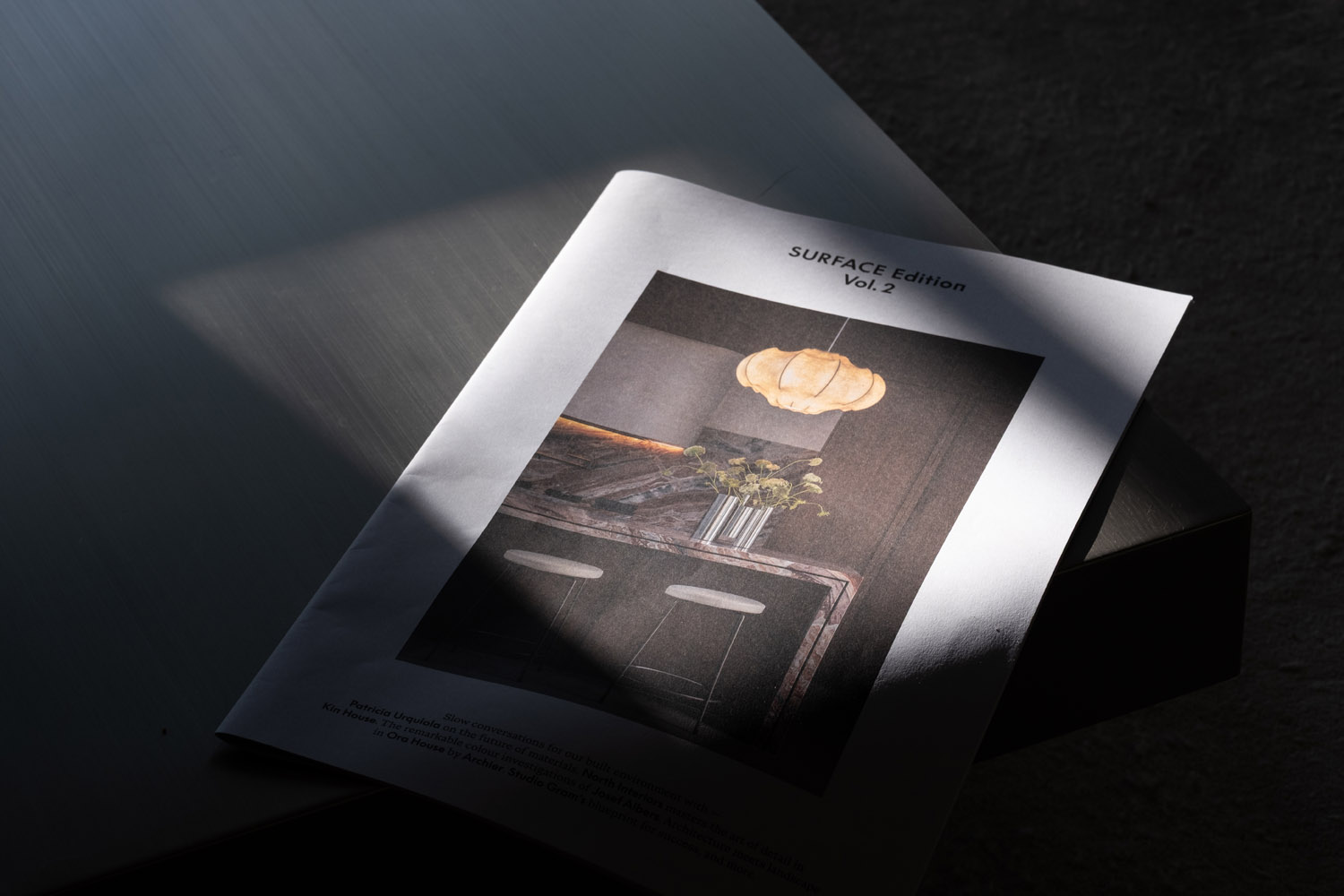
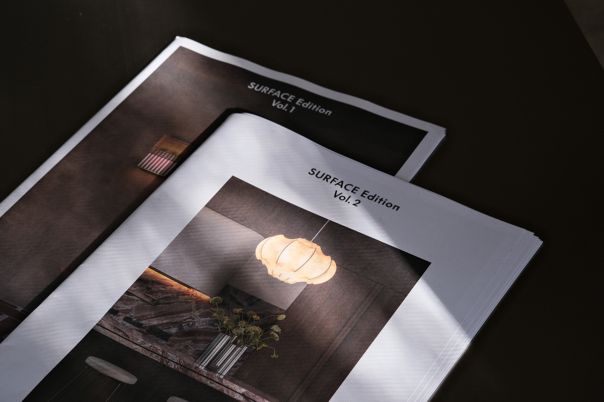
Brought to you in the same generous broadsheet format, printed on a sustainably-produced paper stock that makes the fingertips sing, SURFACE Edition Vol. 2 comprises a collection of stories and conversations that expand our horizons – both geographically and philosophically.
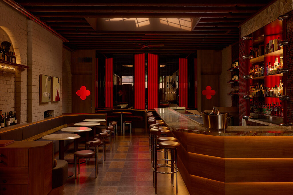
We touch down in South and West Australia as well as Queensland to seek out leaders of industry who meld architectural intelligence with progressive materiality. Here we find places and spaces layered in design-led narratives, orchestrated through elements of colour, pattern and tactility, to elicit a sense of wellbeing, joy, restoration and more.
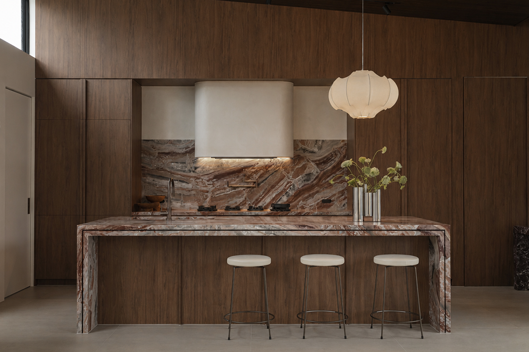
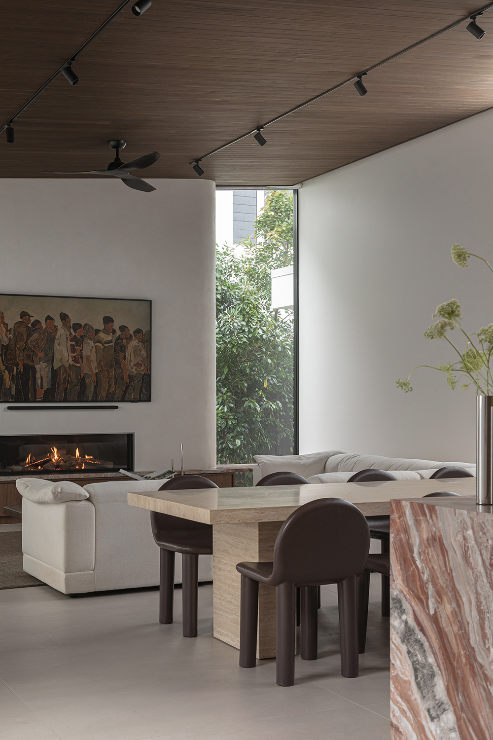
Against the relaxed backdrop of its internal courtyard, Kin House’s kitchen and living spaces reveal imagination and rigour through bold material choices and impeccable detailing. Not one to skimp on the details, interior designer Bryden North proposed the island bench edging be designed with a shadow line that bisects two 40-millimetre-thick edges on either side.
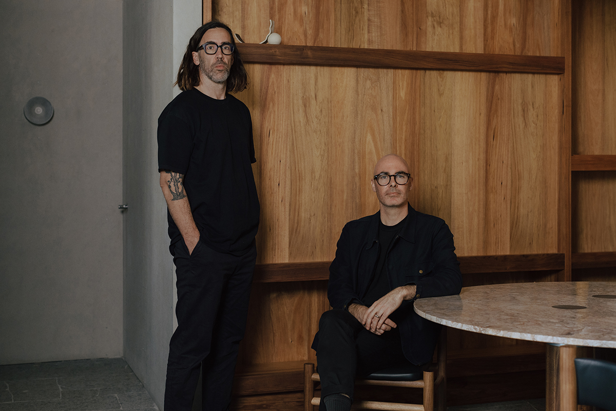
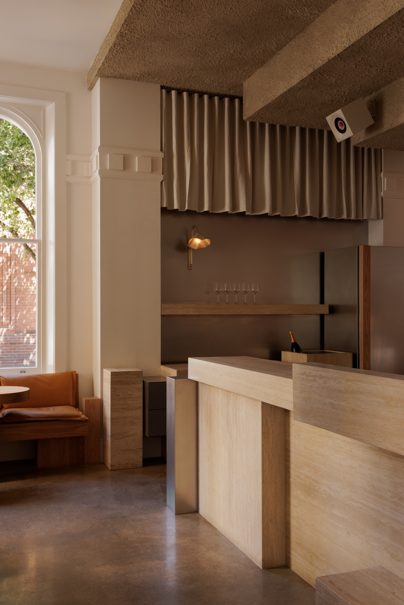
While Studio Gram may not ‘do’ a signature house style, their deliberate approach to materiality has remained constant, and become their calling card worldwide. “The one thing that has tied our work together is our use of material, and that’s probably never going to change. It’s not about a particular material but how we use and handle it, and the qualities we seek in materiality,” says director, Graham Charbonneau.
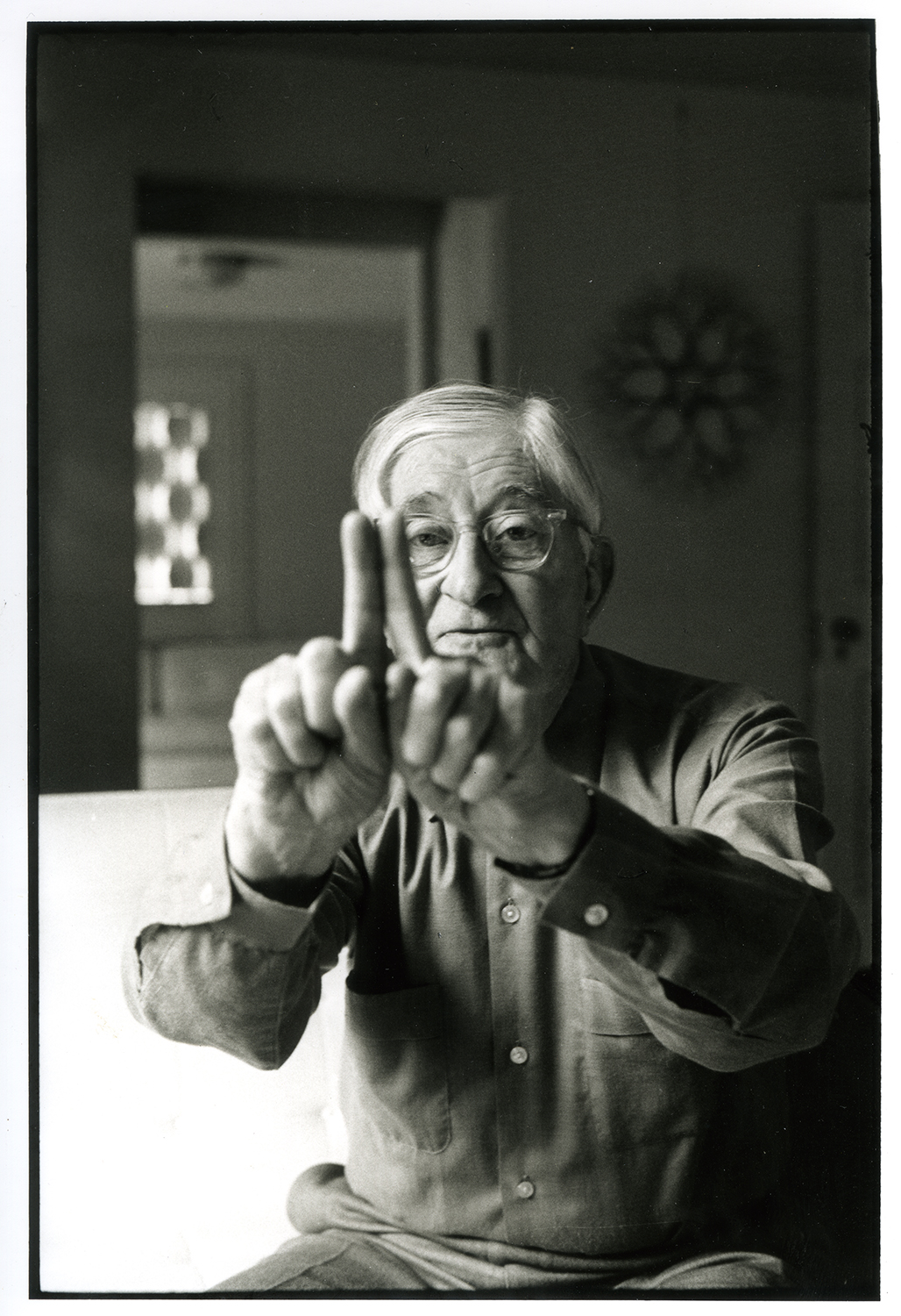
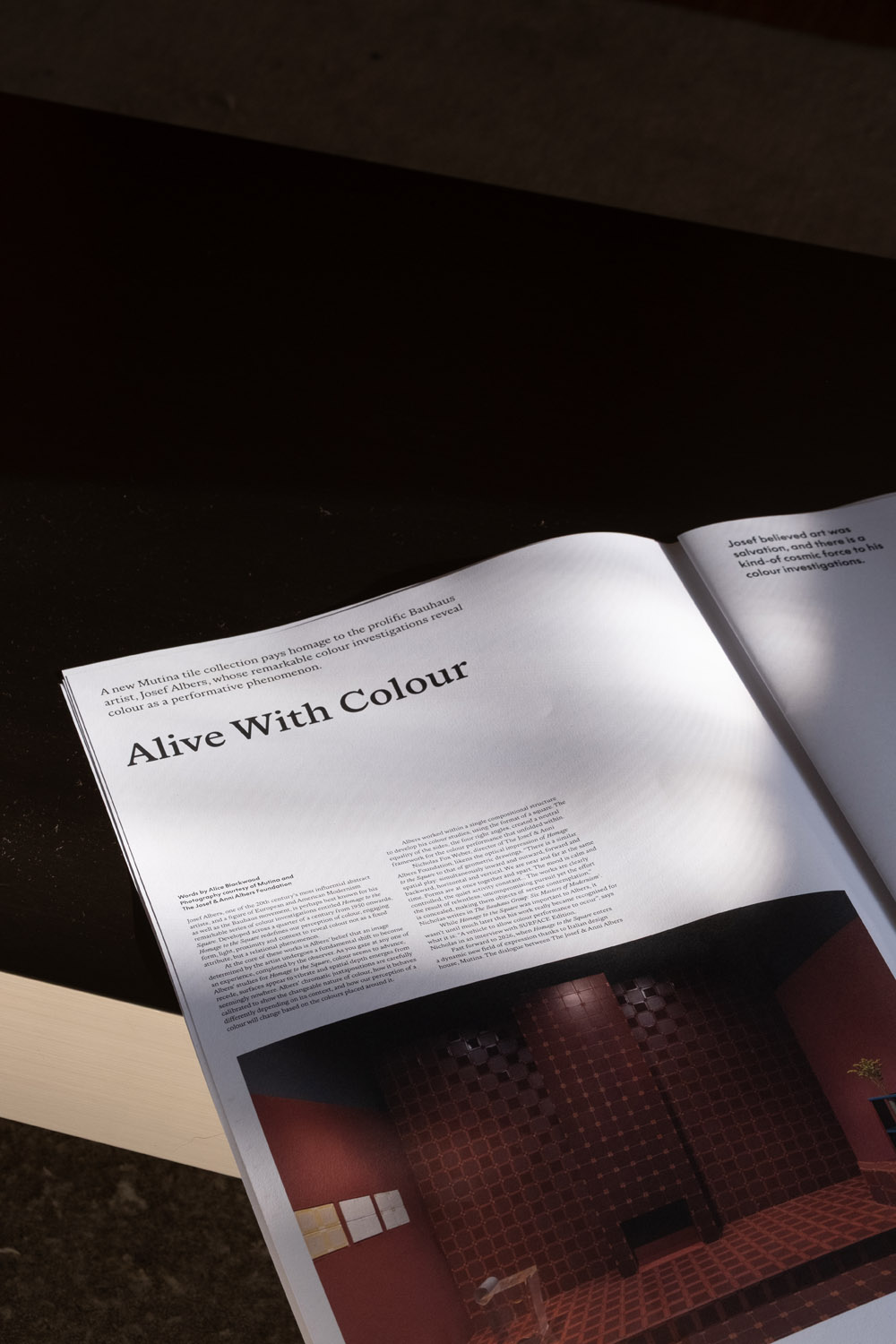
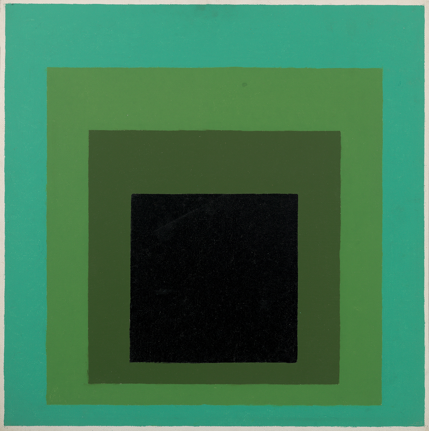
It all began with the prolific Bauhaus artist, Josef Albers, whose remarkable colour investigations reveal colour as a performative phenomenon.
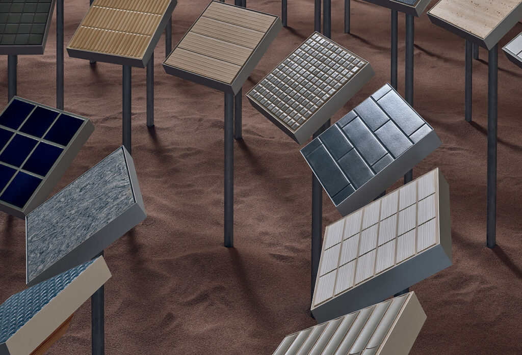
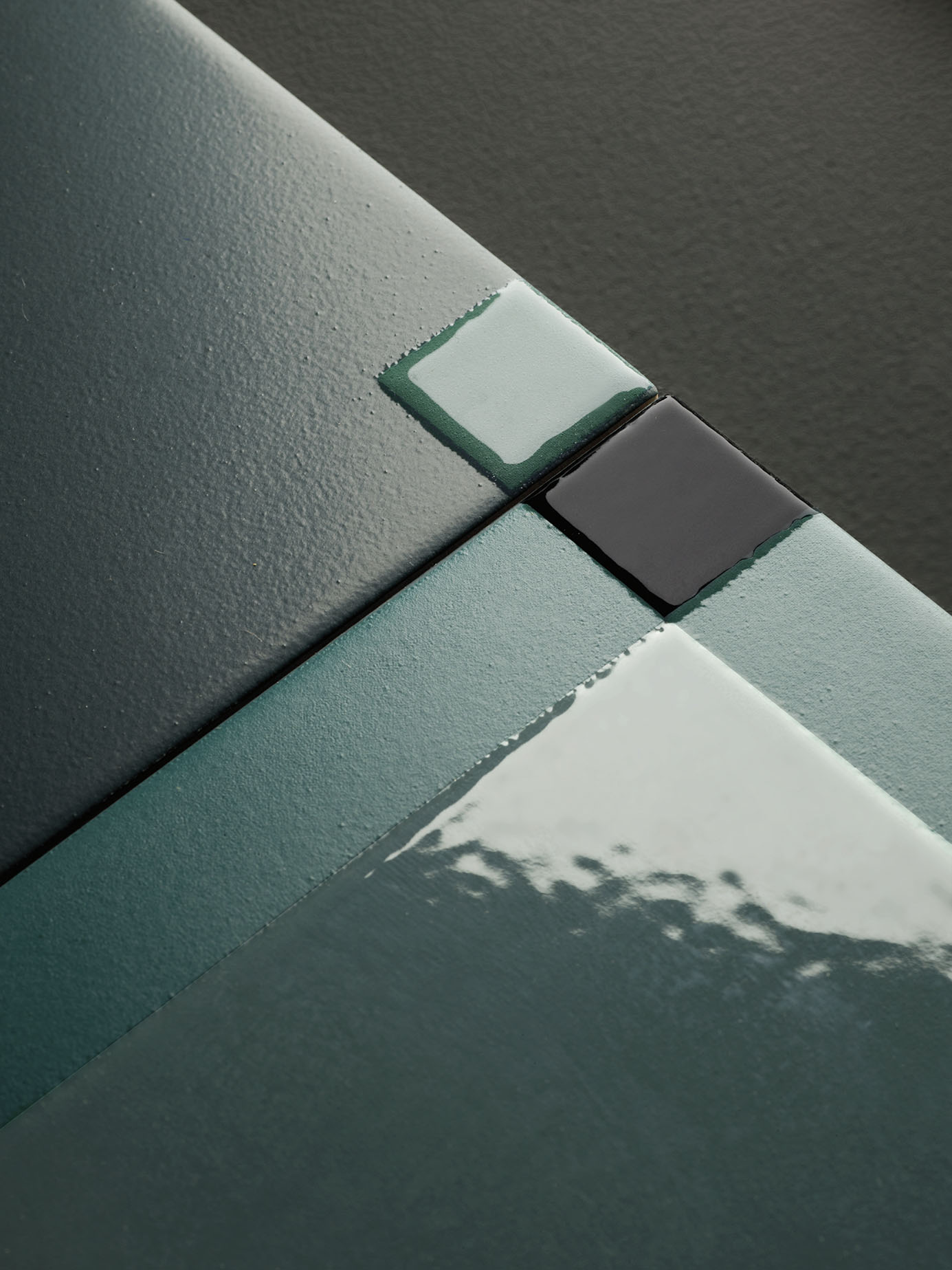
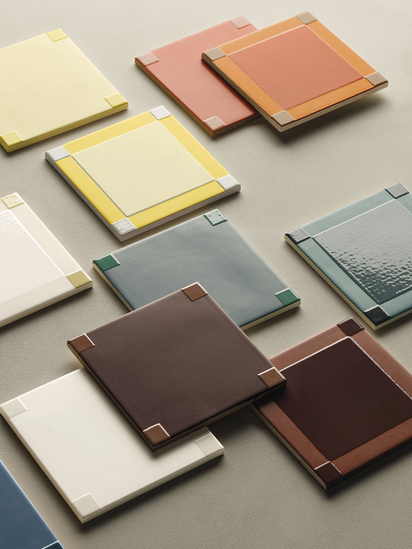
Albers’ belief that colour is continually shaped by its context, rather than existing in isolation, provides a framework for Mutina’s nuanced translation of this art-led research into the field of architectural ceramics and spatial design. This contemporary material dimension draws upon the tonal range of Albers’ Homage to the Square series, similarly achieving that magical, optical effect of shifting hues that resonate according to light, spatial conditions and compositional rhythm.
You’ll find all these stories and more in the new SURFACE Edition Vol. 2. Now available to read in print, you can request your copy here.