Words by Alice Blackwood
Photography by Martina Gemmola
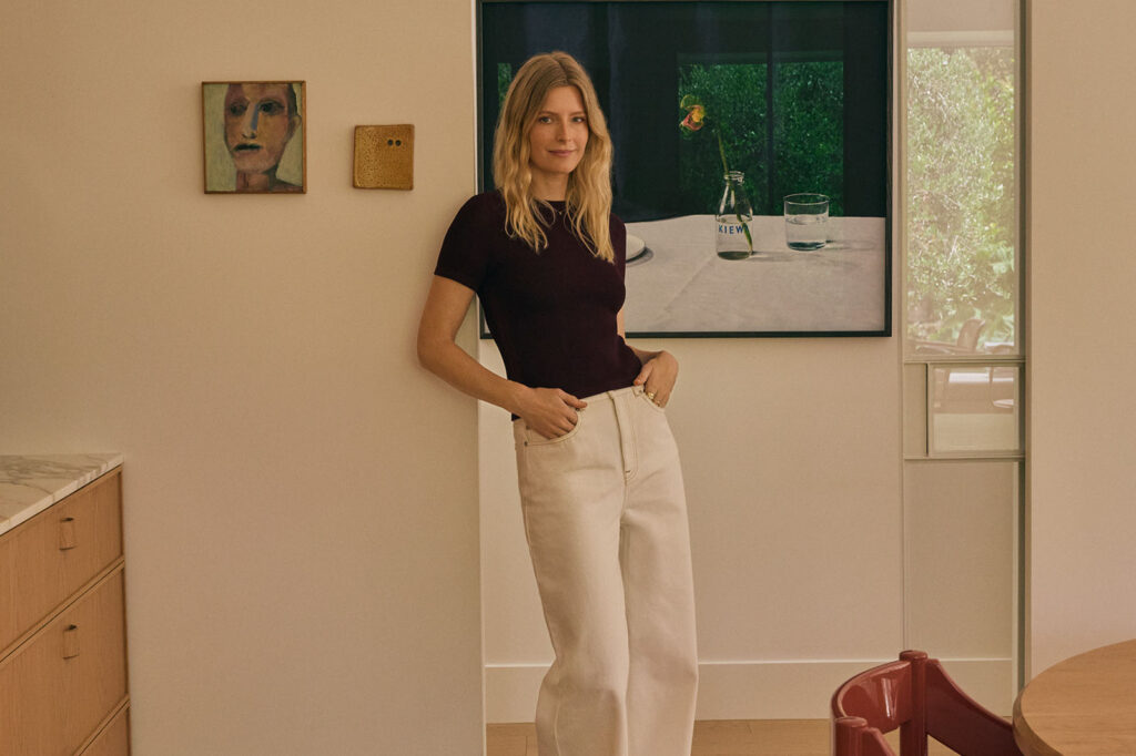
There’s nothing more delicious than a new Australian design discovery: a fresh face on the scene with a clear and distinctive point of view that arrives like a force of nature. It may explain why Studio Shields, led by Ruby Shields, has so quickly bewitched us with its vigour, enthusiasm, and sensory-rich designs which draw on colour, materiality and maker-culture to create spaces that are experienced rather than simply observed. Spaces that are both distractingly beautiful and deeply complex in their composition of references, influences and personal storylines.
Joy Haus in Victoria’s Mount Eliza is Studio Shields’ first official project ‘on the books’. It’s a statement of intent and a promise of what’s to come. In designing Joy Haus, Ruby has cemented her own design process – one that recognises the important of storytelling as a design tool – while also exploring her own design language. Storytelling is a skill she honed in her previous career as an art director in advertising, working across a diverse portfolio of luxury and mainstream brands. “I learnt a lot about telling stories through different lenses,” she says.
That experience also taught her the fine line between establishing her own design language without over-riding a client’s story.
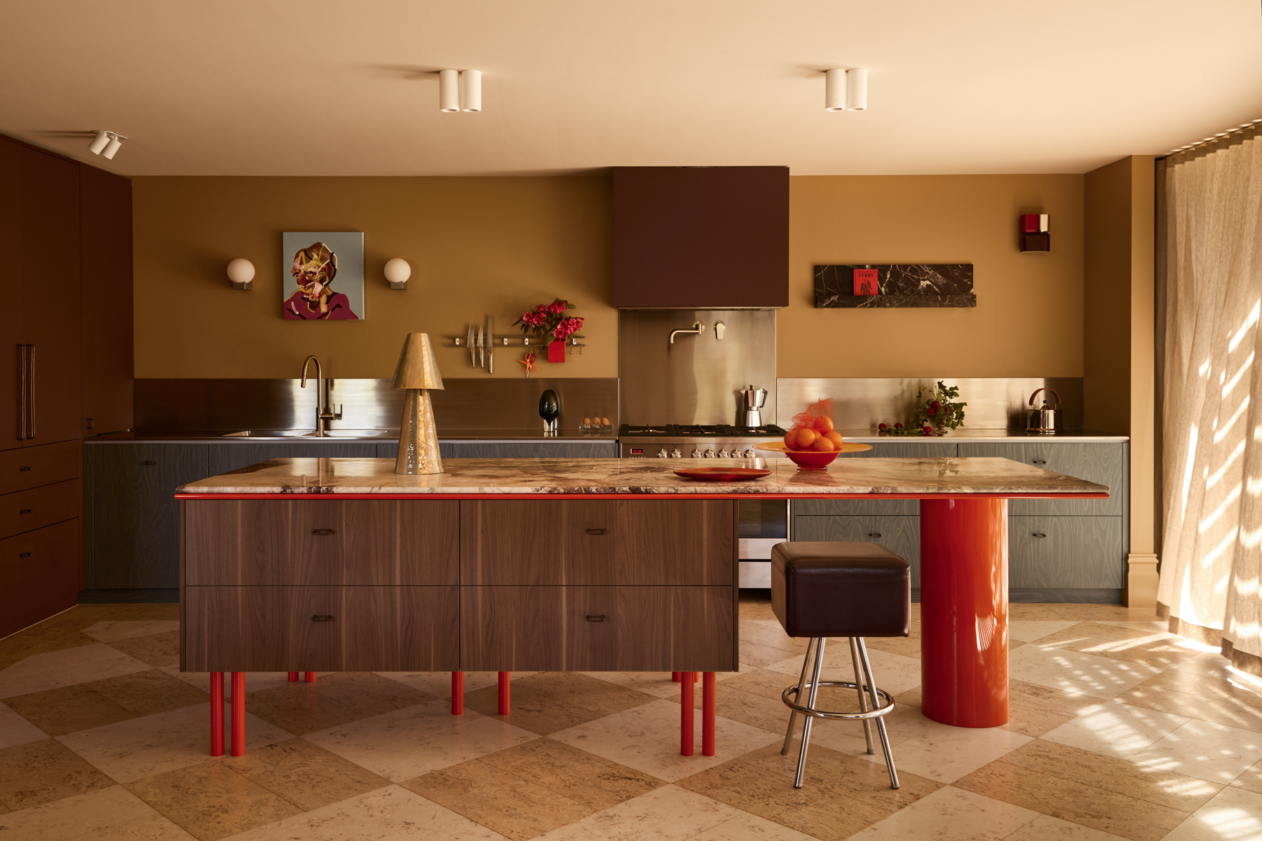
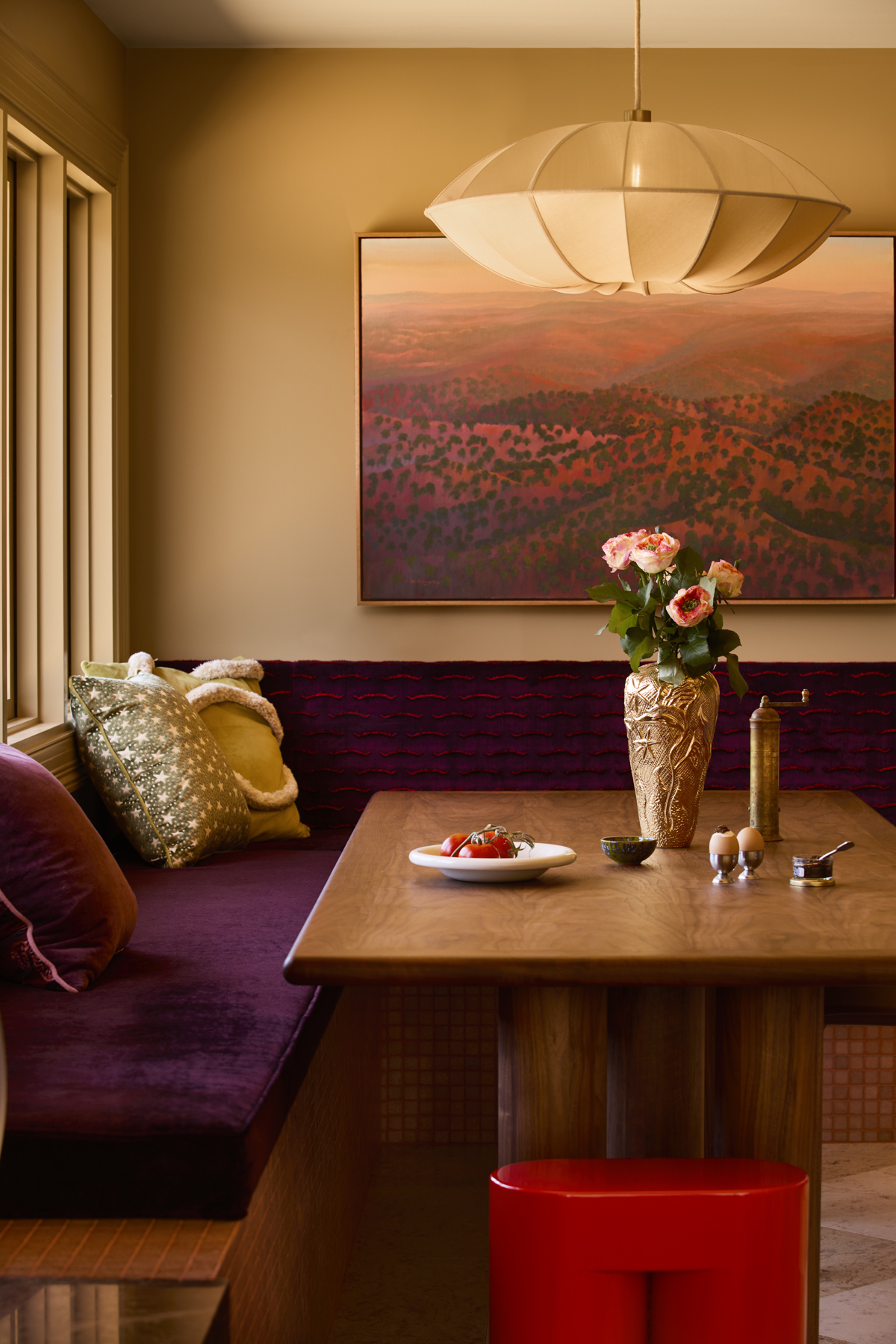
The clients of Joy Haus came to Ruby with a vision for a colourful yet durable home that expressed their personalities and could stand up to boisterous family life. “When I met with them, I brought a heap of materials to review. What spoke to them was the tactility and the boldness in colour. My job became one of refinement, making sure there was a conversation between the materials,” says Ruby.
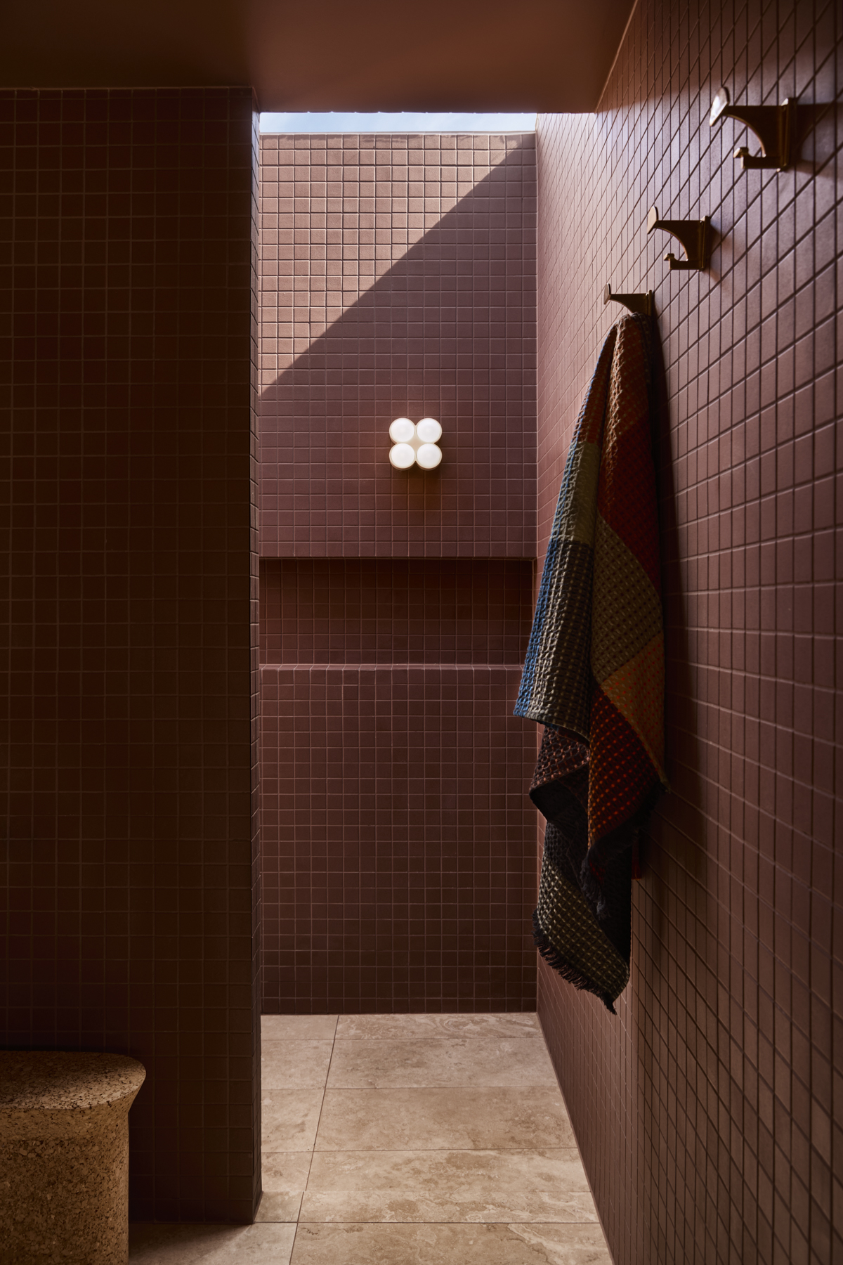
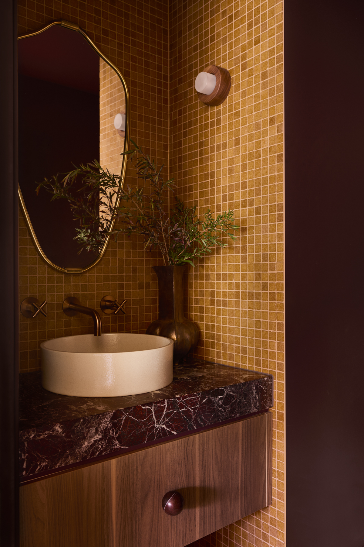
Red spoke strongly to the clients, and Ruby translated this into the interiors through a symphony of burgundies and rich, earthy loam hues. “Their love of life and this passion and cheekiness… I wanted to make sure their house had some of that tongue-in-cheek in it.” To this end, Ruby has introduced interludes of orange, pink and sunshine yellow – optimistic colours for an optimistic outlook on life. “I didn’t want the house to ever feel repressed. As soon as you walk through the door, it’s light, it’s bright and it encompassed them.”
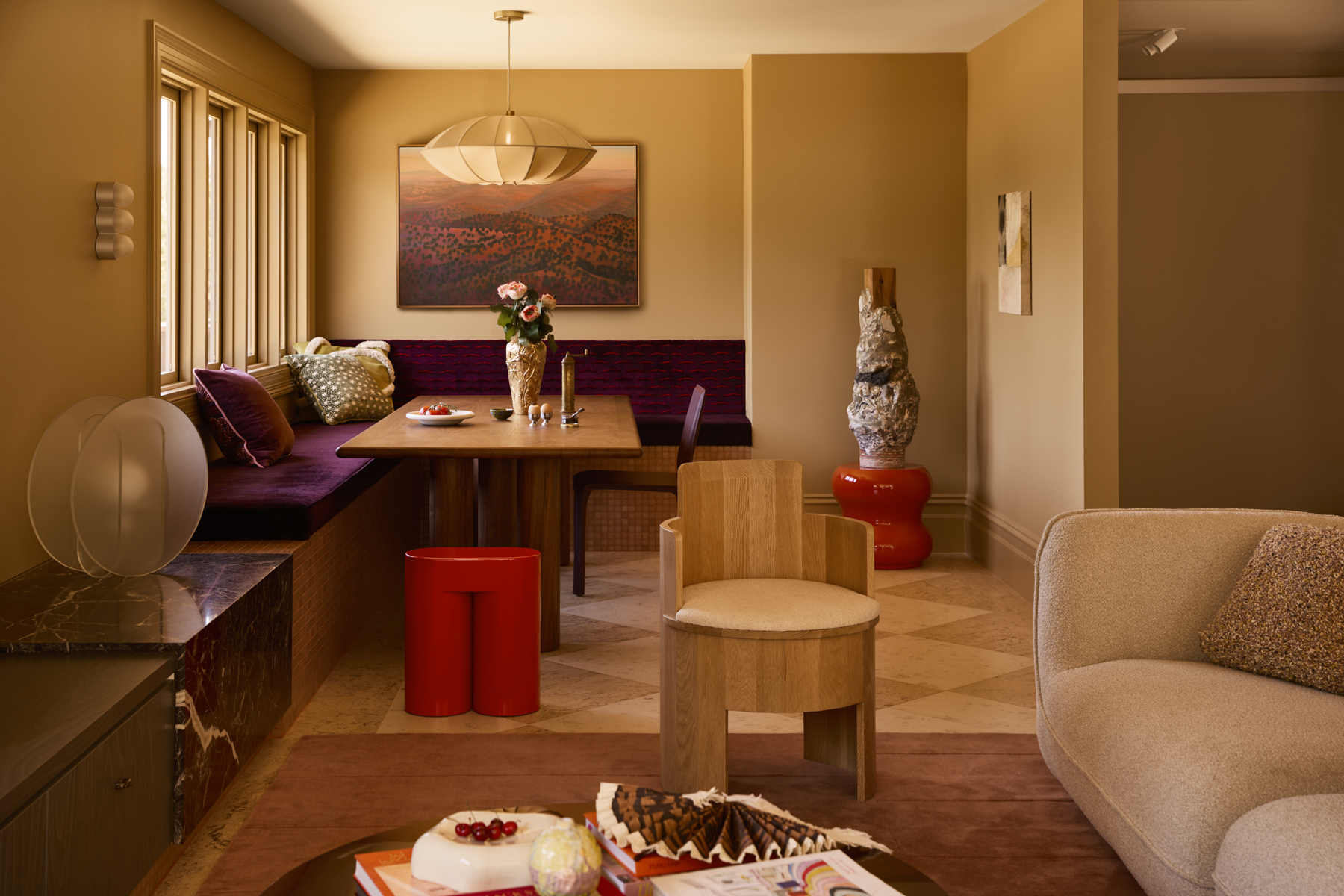
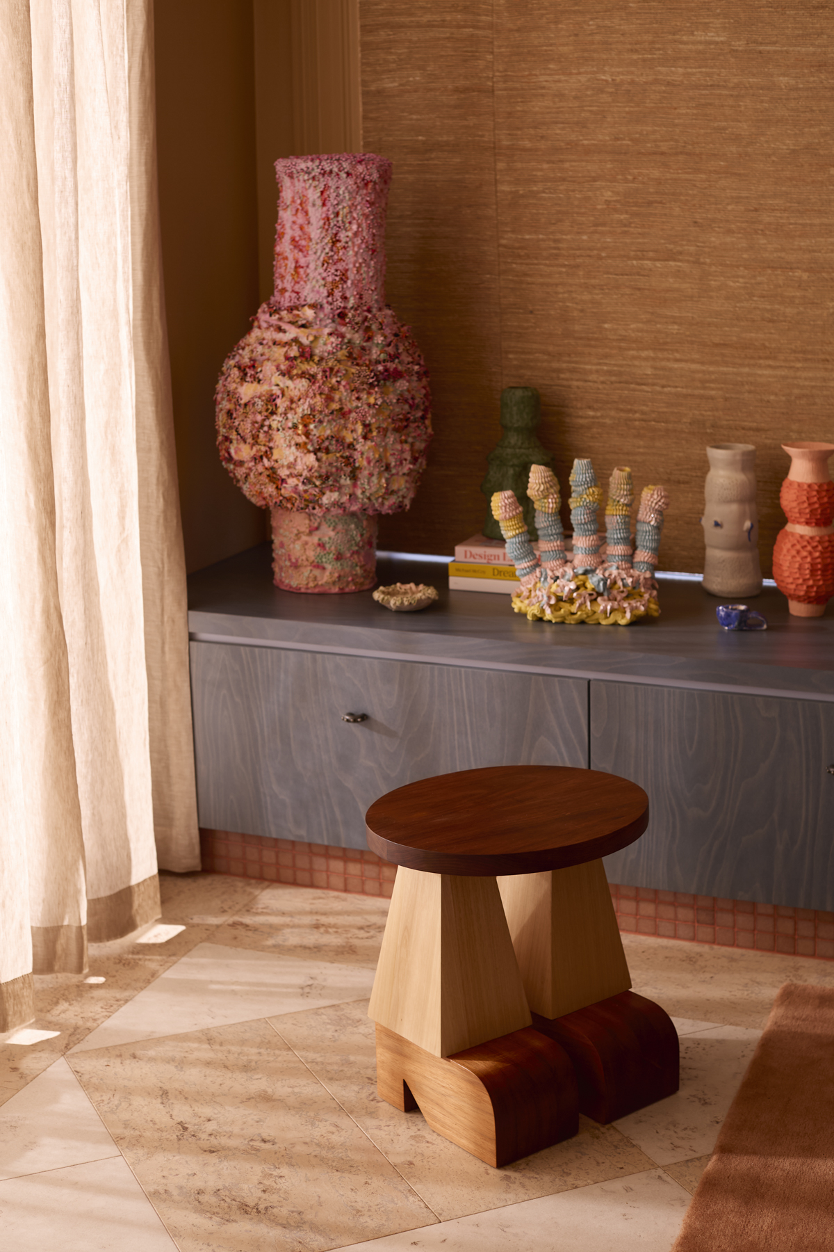
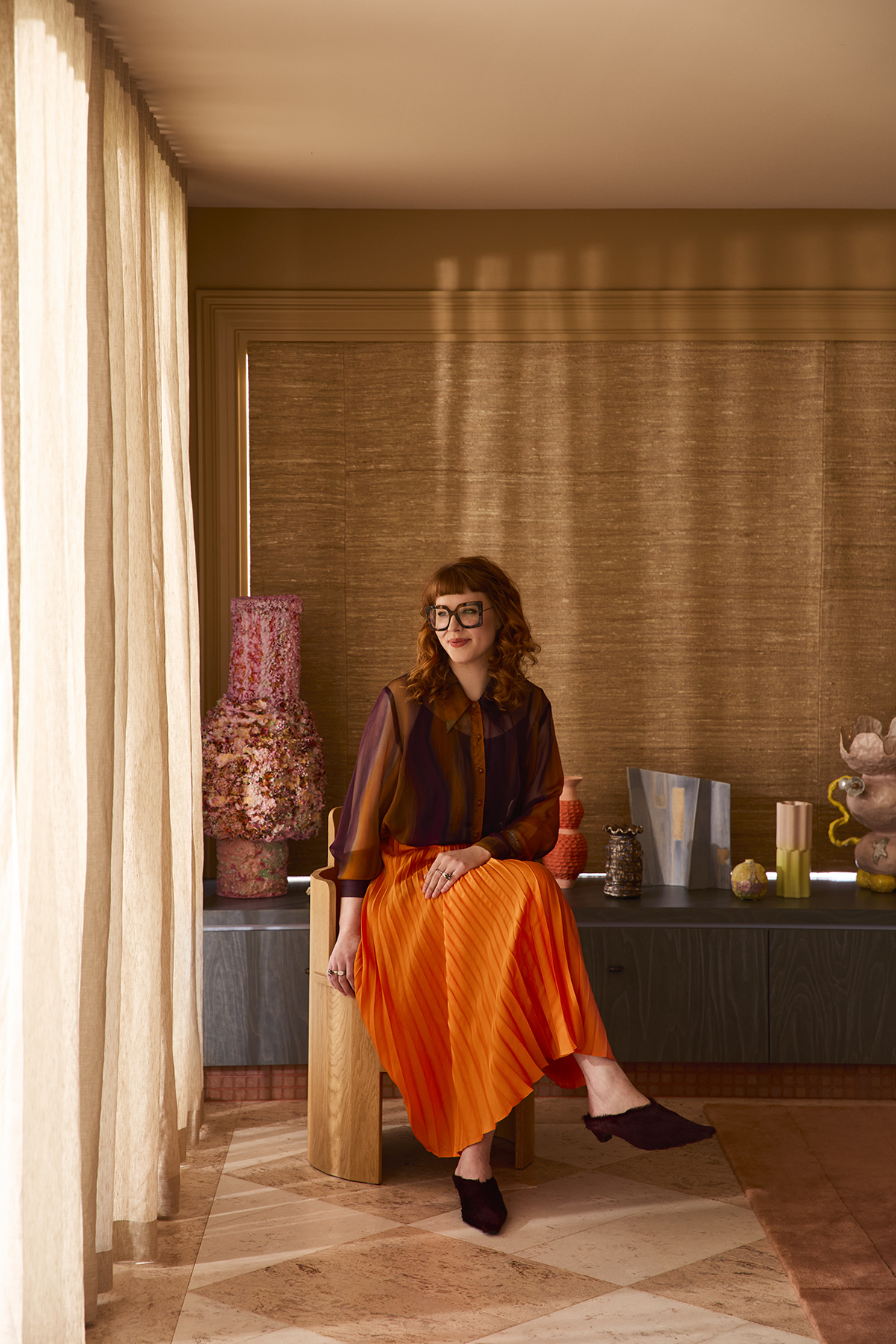
Underscoring her colour and material selections is a focus on durability and functionality. Ruby has orchestrated the living spaces using finishes such as 70s-esque laminate joinery. She also highlights the glass-like shimmer of pink Vixel mosaics that define the banquette seating ‘kicker’ in the dining zone. “Those tile kickers just really hit the spot,” she says. They’re the juicy centre of a layer cake of chequered cork flooring and velvety plum-toned upholstery.
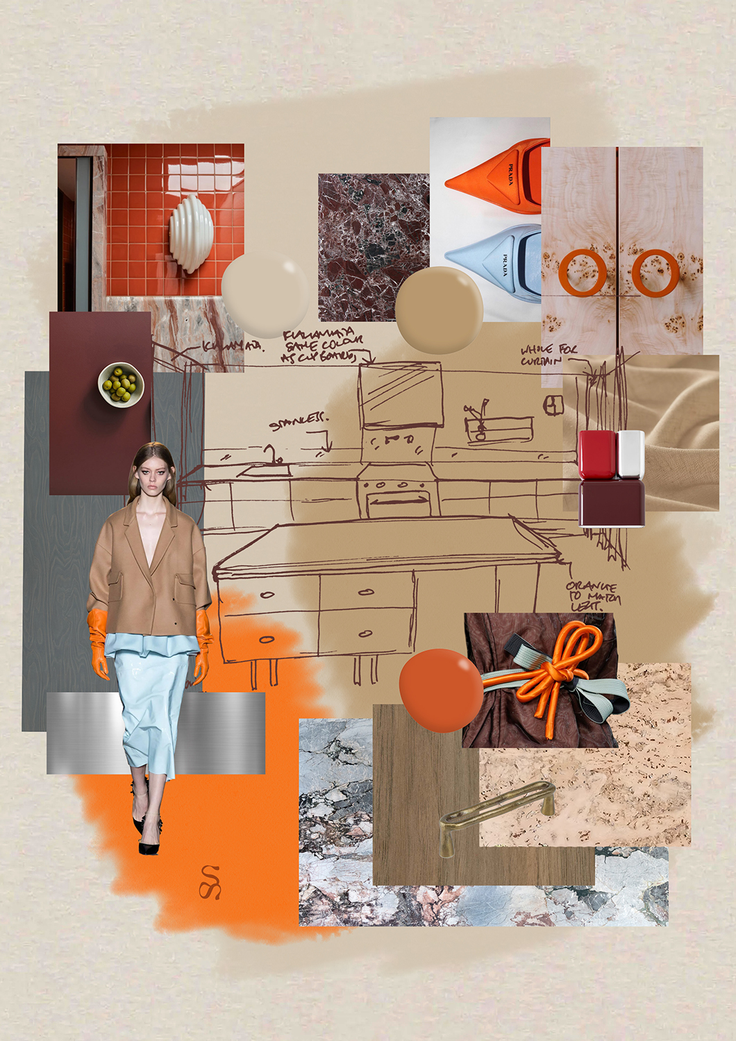
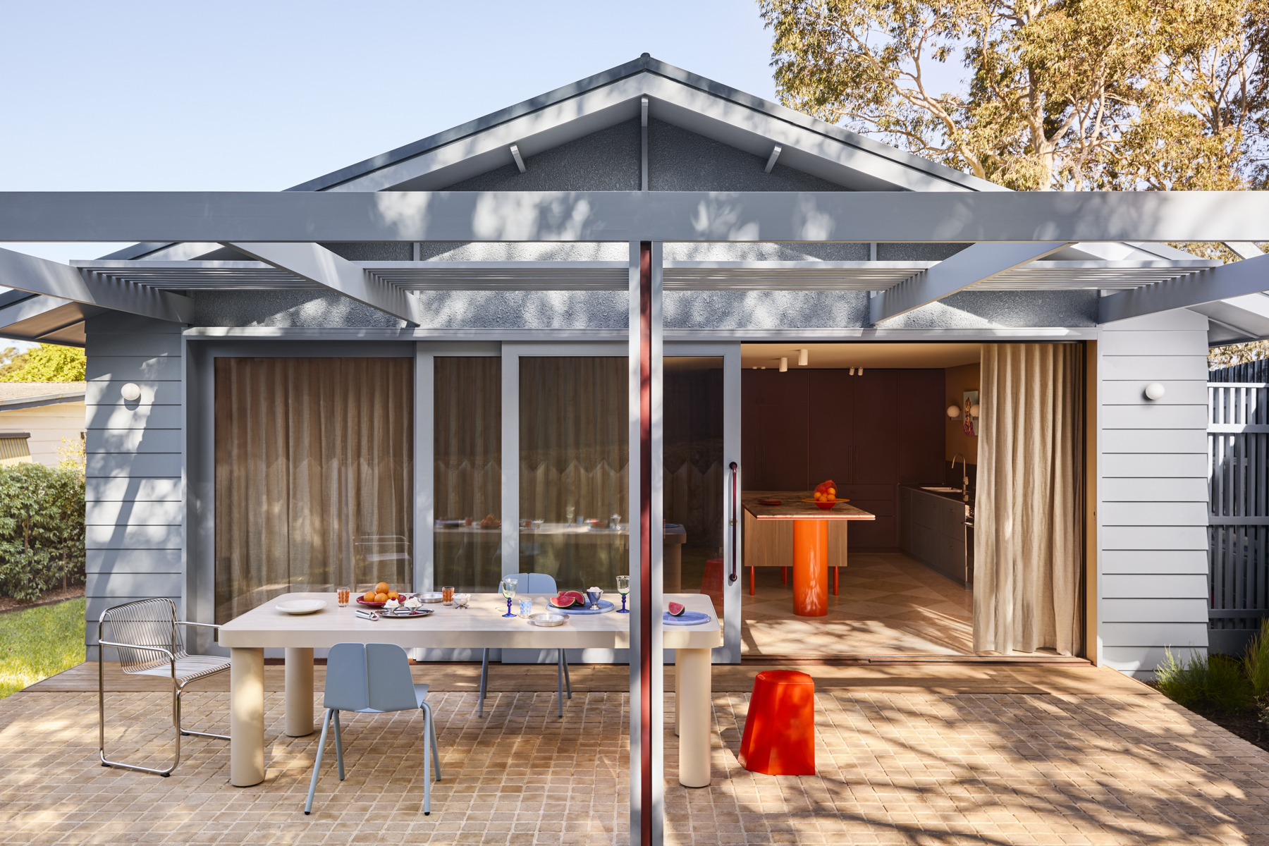
A rich, vibrant threshold of Artedomus Rosso Levanto marble offers a lively transition between the neutrality of the cork and travertine flooring. This in turn speaks to the Dulux Eastern Gold in the living spaces and the warm beige tones used through the hallways. “I’m super proud of how all the materials talk to one another. Even the kitchen island with the pop of orange on the legs is reflected through the study in the clients’ main bedroom.” Narrative ties and linking storylines at every turn.
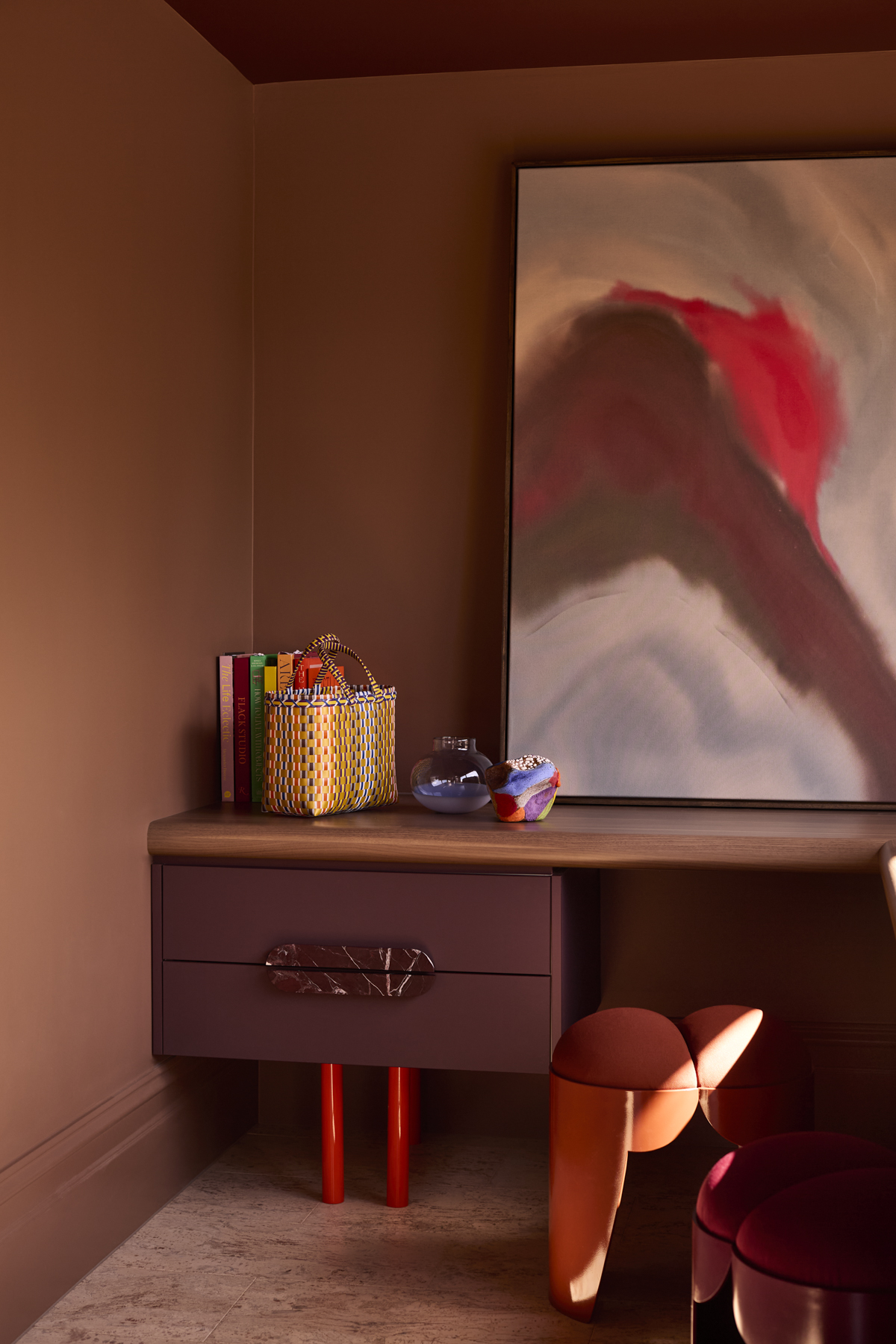
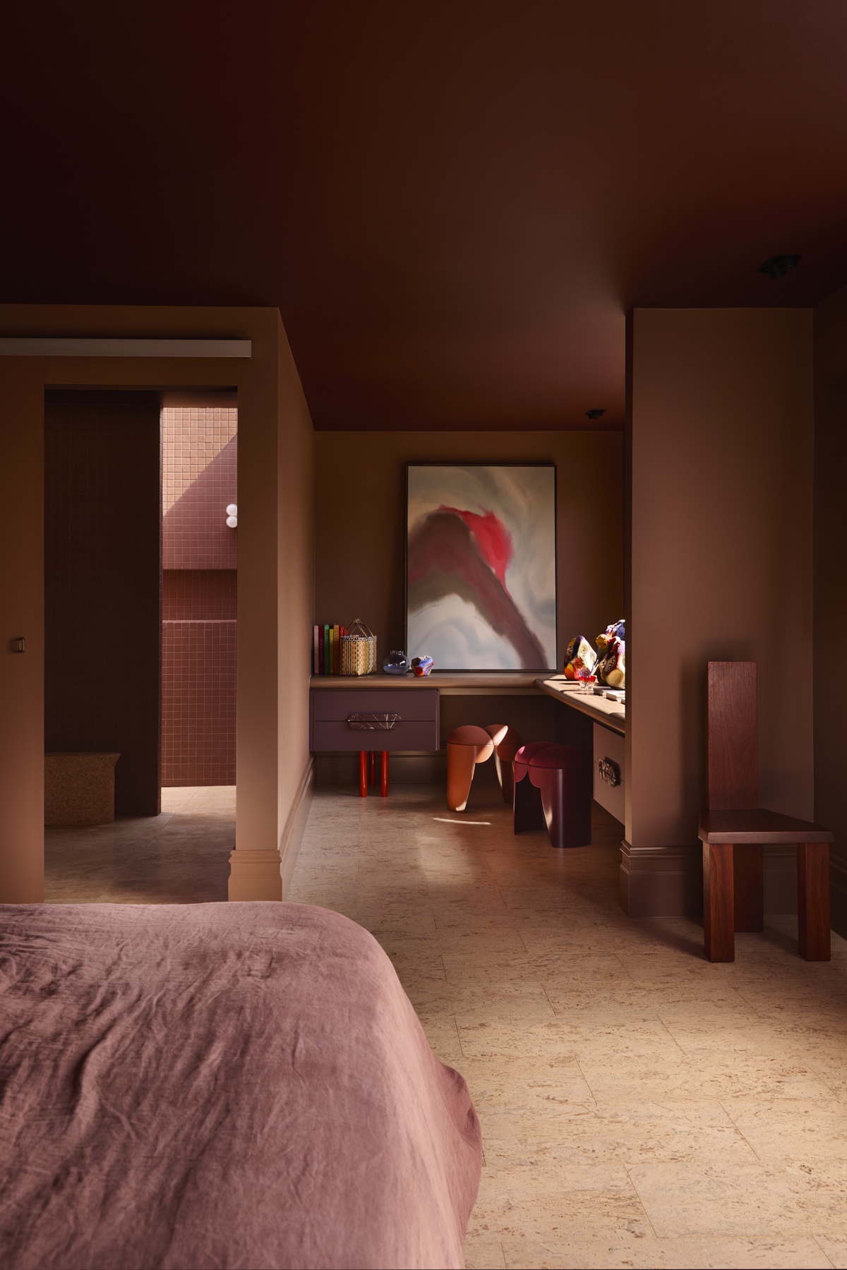
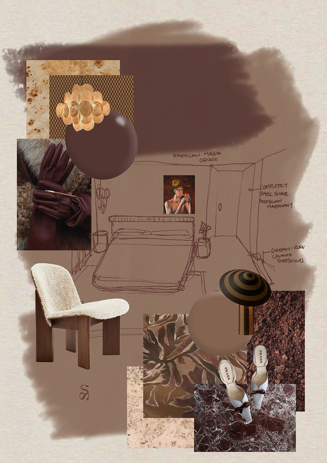
Ruby likens her approach to that of a composer, and she knows when something is out of tune. Material compositions are finely calibrated down to the shade or tint, while bold, break-through moments are designed to trumpet in the right place at the right time. “It all comes back to my childhood of collecting and pulling things together. Always thinking – how does that work? How can it be different?” she says.
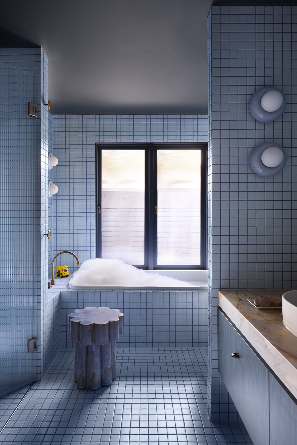
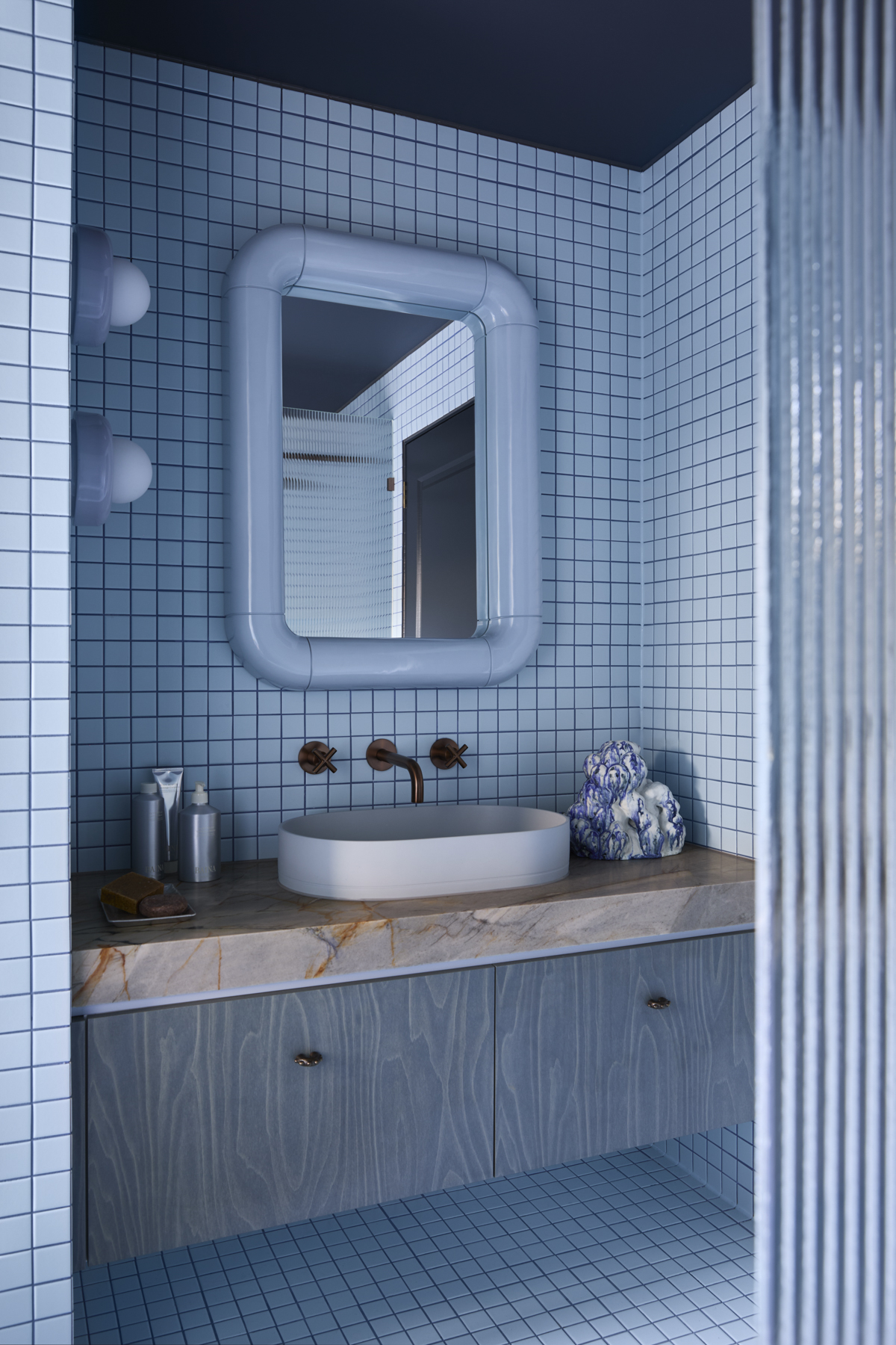
You’ve probably worked it out by now, but Ruby’s compositions tend to be colour-led and her knowledge of products and finishes, hue by hue, is formidable. The children’s bathroom, a colour-drenched oasis of blue, is a perfect example. “Blue is one of the hardest colours to work with. If you don’t get the right blue, it can throw an entire project. I looked at about eight samples before I found that exact blue tile,” she says. The INAX Accordi M ADM261 coats the space floor to ceiling – a bathroom made for a magazine (back) cover.
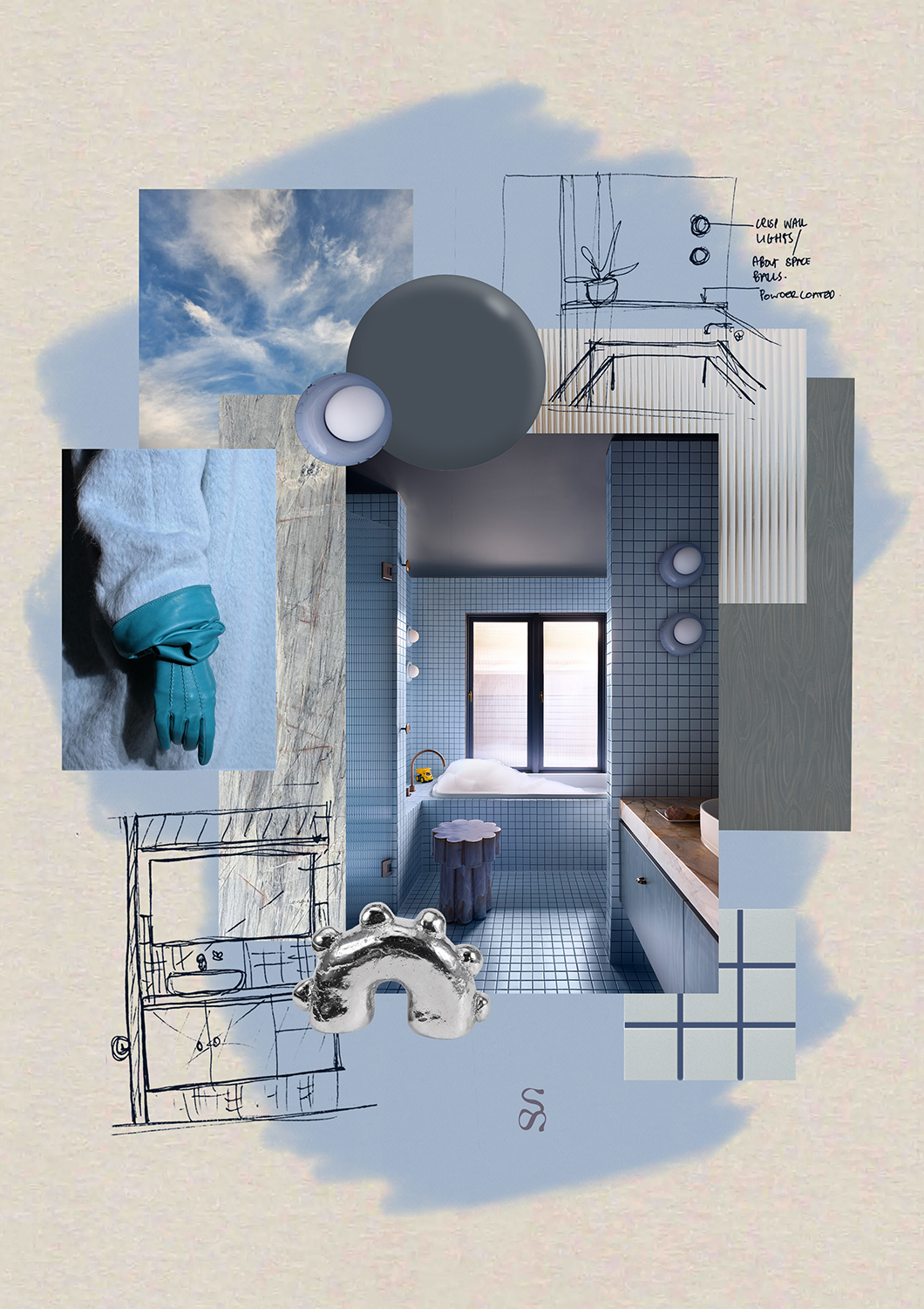
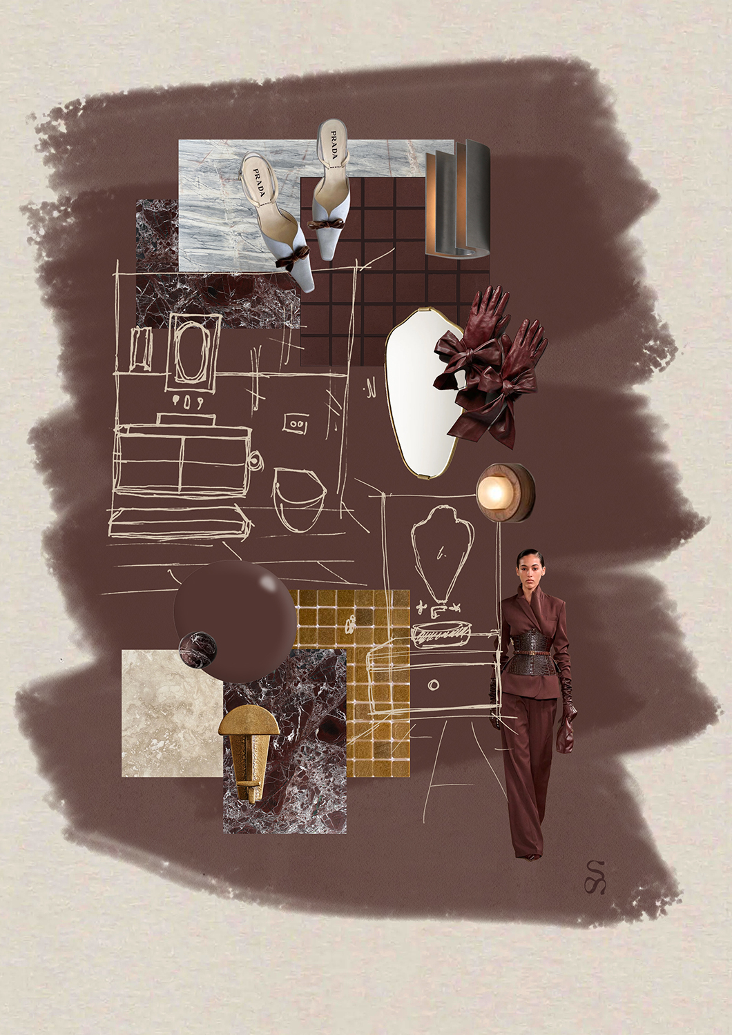
The imaginative child and the art director continue to live large in Ruby’s design process. She fills pages of little books with ideas, feelings and sketches. She presents her material compositions in flat elevations, supplemented with collages that blend inspiring imagery with palettes of materials, objects, fixtures and more.
At Joy Haus, the burgundy, the blue, the beige and the orange have been lifted off the page and given functional form in everyday living spaces that bring joy and comfort. Ruby has received feedback that the home feels so warm and cocooning that her clients are hard-pressed to get their guests to leave. That’s a job well done.